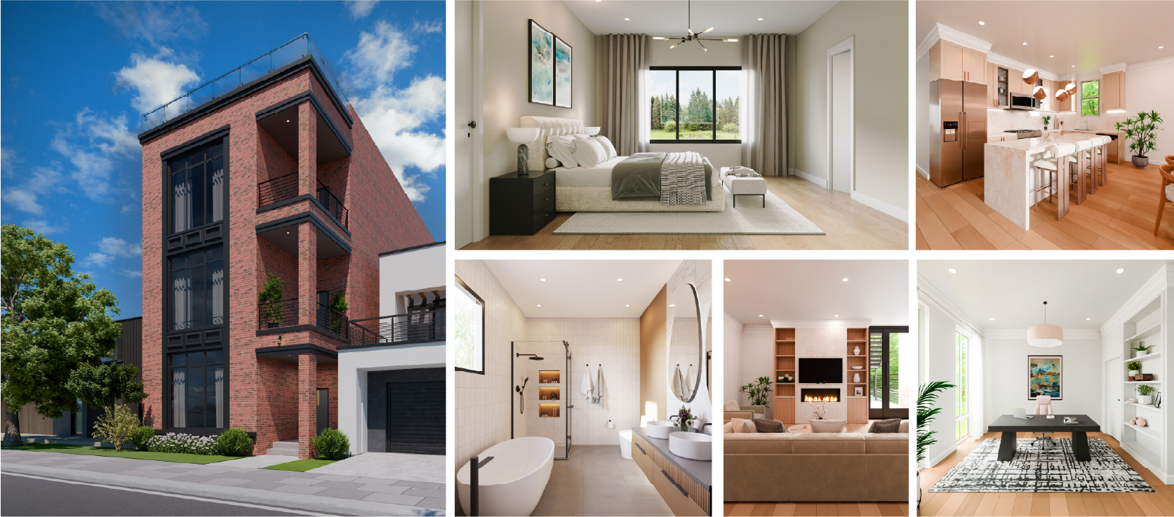


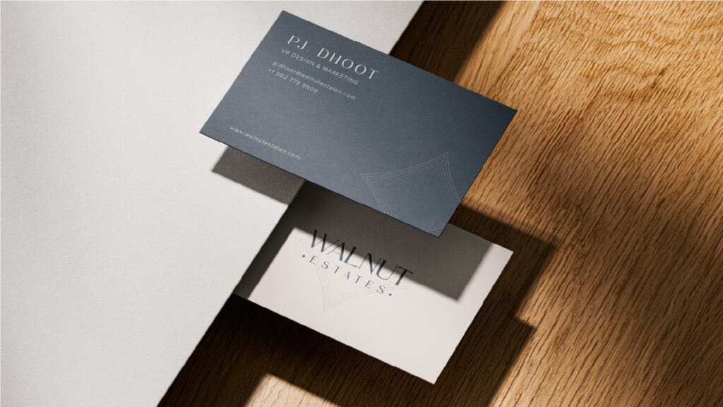
The team was impressed with the life-like VR tours, which have been invaluable for showcasing our unbuilt properties to prospects from anywhere. – PJ Dhoot,
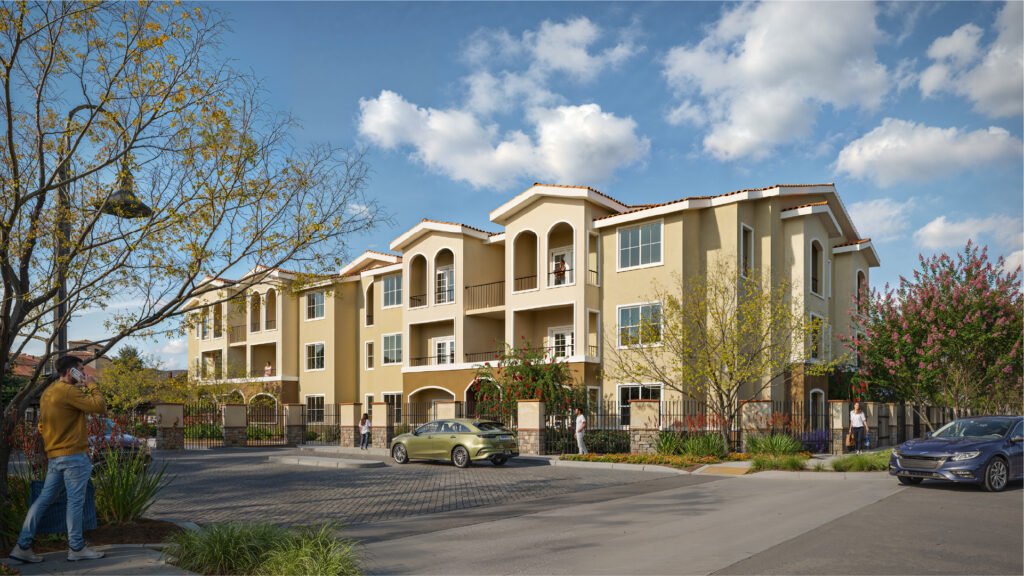
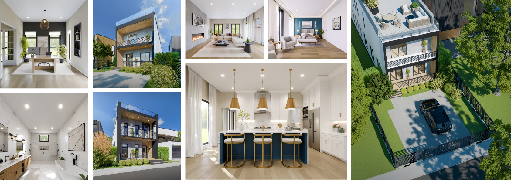
“We were impressed by how lifelike and detailed the renderings turned out. Their prompt communication kept everything on track, and the high-quality visuals truly elevated
“Extremely happy with the finished renderings and impressed by the quick turnaround. I highly recommend their services.” – Mark Zorn Chat with us Industry: Real
